Beautiful Baths, Creative Storage

Almost every one needs more storage in their bathroom. Perhaps we all need to get a bit more organized, but if you are clutter challenged like me, I wanted to show you some wonderful baths by designer, Molly Frey. You may remember a previous post on a fabulous coastal house by Molly here.
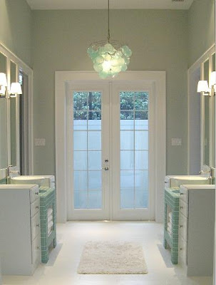
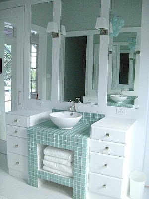
I love the bath above. Let's take a look at some of the elements that make this bath fantastic. First, the overall design with the sink sitting upon an open turquoise glass tiled cabinet - a perfect spot for storing extra towels. The wall mirror is framed out with sconces adding the perfect lighting.
A capiz shell chandelier adds a bit of whimsy to the space. I imagine the french doors lead you outdoors to a secluded hot tub - wishful thinking? I also love symmetry and this bath is a great example.

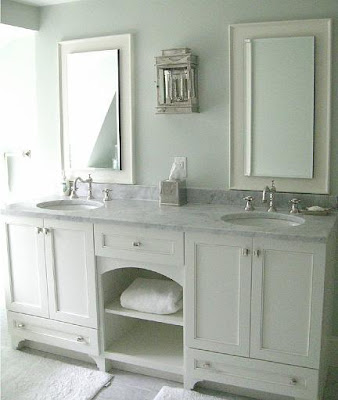
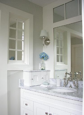
Of course Molly's marble baths are what generally catch my eye. Here is lovely example that was published in Traditional Home Magazine. The middle cabinet is open - again a nice spot for baskets or extra towel storage. Notice that the cabinets have "feet" to give the sink base the illusion of free standing furniture. I also love the sconce in this bath.

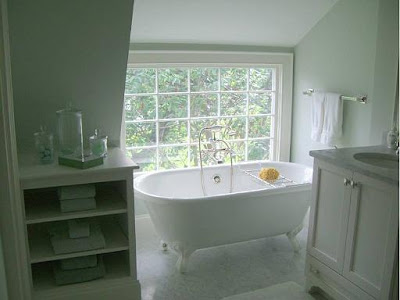
The tub is tucked under the eaves of the home in front of a gorgeous window and next to it we see another area for storage.
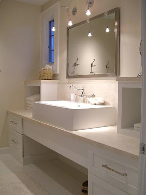
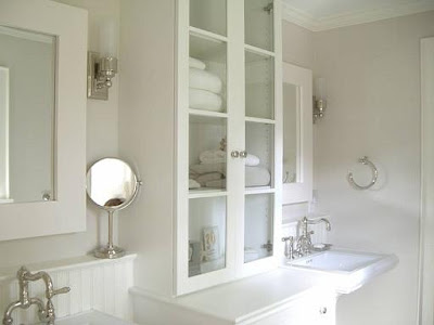
Here is a more streamlined, contemporary feeling bath. Two small boxes topped with limestone add the additional storage here. By not putting small doors on these, the look stays very open and contemporary - Interesting!
A more traditional design also shows you some ways to increase storage. Here the cabinets flanking the pedestal sinks sit directly on the counters. Unlike a kitchen, counter space in the bath can be more narrow to support your toiletries. The small ledge behind the sinks also add a space for lotions and creams.
Here we see a shallow medicine cabinet with mirrored doors built into the design. Not only is this cabinet functional, it becomes a wonderful focal point. This bath also has "feet" on the cabinet base.
The final bath has this cute little cabinet on the left side. A great spot for a razor and shaving cream - or perhaps it hides electric outlets and a blow dryer.
Above are several ideas to add a bit storage to your bath. To check out more of Molly Frey's work click here to her website or here to her blog!
(all photos property of Molly Frey)

Ashley Furniture Showroo|Ashley Furniture Canada

Ashley Furniture Showroo|Ashley Furniture CanadaAshley Furniture Showroom|Ashley Furniture Canada

Ashley Furniture Showroom, Ashley Furniture Canada is a Ashley Furniture Store Canada Location. In addition to the Ashley Furniture Showroom, Ashley is also called Ashley Furniture Store If you want a good collection from Ashley Furniture Showroom please visit the Ashley Furniture Store.

Ashley Bedroom Furniture-Ashlyn Wood Bedroom Furniture

Ashley Bedroom Furniture-Ashlyn Wood Bedroom FurnitureAshley Bedroom Furniture-Ashlyn Wood Bedroom Furniture

Are you looking Ashley Bedroom Furniture?This is the best bedroom designs from ashley furniture. The design of the wooden bed by this Ashey Furniture, smooth curved design, the "Ashlyn" bedroom collection creates a contemporary, relaxed style that must have collection to enhance the beauty of decorating your bedroom.I f want this "ashlyn" bedroom furniture please click here, or if you want to know Ashley bedroom furniture collection please visit ashley furniture Outlet.

Modern Minimalist House Home design

Minimalist House Home Designare you looking for modern minimalist house design is the minimalist home design photos with a swimming pool and a garden near the house that separates the two parts and is the perfect place to bersatai and spending time with family, this is a minimalist house design that is perfect for you . Minimalist house design concept is to create an open and filled with light living space which also has some privacy. The first floor has a glass wall that leads directly to the pool.

Minimalist House Home DesignMinimalist House Home Design

Minimalist House Home DesignMinimalist House Home Design

Minimalist House Home DesignMinimalist House Home Design

Retro Kitchen Design for Modern and Minimalist Home design

Minimalist Retro Kitchen DesignAre you looking for retro kitchen design or minimalist retro kitchen design for your minimalist home design? This is retro kitchen design photos yet built with modern design concepts to your minimalist home, please look at this kitchen design to add your reference in designing your kitchen with the concept of retro with modern and minimalist style, I hope you like this.

Minimalist Retro Kitchen DesignRetro Kitchen Design with modern concept design

Ashley Alison Hall Bedroom Furniture

Ashley Alison Hall Bedroom FurnitureAshley Alison Hall Bedroom Furniture

Are you looking Ashley Bedroom Furniture?this is Ashley Alison Hall Bedroom Furntirue, Modern  The "Alison Hall" Ashley bedroom furniture collection takes the idea of the country cottage getaway and creates the perfect bedroom furniture to bring that feeling to life.

Oh, JOY!

Yes, I said Oh, JOY!
Thanks to this darling woman, Joy Gabler of the Vintage Rabbit
{whom I met online via blogs} we met up with the Sassy girls of Urban Barn today! 
We are SO glad we made time to head over there.
This fun group of gorgeous, talented, creative gals are stylin' their hearts out in their new Escondido diggs. WHAT a location and oh my, the plans they have...Check out their blog, visit their shop from Wednesdays thru Saturdays every week, and make plans to attend their Grand Opening show July 16 through 18 - we're bringin' Retreat's 'Taj Ma Tent'  for the party and we can't WAIT!
SO...Thursday, we're headin' back up North to get to work!
Gotta' get ready for Petite Retreat, 
then Farm Chicks, 
then Petite Retreat AGAIN, 
then URBAN BARN! 
And then BarnHouse! 

Whoossh.....
{Images: Bob & Deb Kennedy for Urban Barn}

Modern Ashley Bedroom Furnture decorating ideas

Modern Ashley Bedroom Furnture decorating ideasModern Ashley Bedroom Furniture decorating ideas

Are you looking Modern Ashley Bedroom Furniture or Ashley solid wood furniture with Classical Ashley bedroom Furniture? this is a Ashley Bedroom furniture with solid wood Ashley bedroom furniture.

Modern Ashley Bedroom Furnture decorating ideasModern Ashley Bedroom Furnture decorating ideas

Passion for Purple


Can I just state on the record how excited I am that purple is starting to creep it's way back in style (both in fashion and in home decor)? I've long been a fan of purple, in all its many forms (though particularly in its richer, jewel-tones of plum and aubergine), and it's been frustrating trying to incorporate the color into the decor of our new house as there are precious few options in the hue. But, as I see more and more purple popping up in interiors magazines, I feel confident that is in the process of changing and that in a year or so purple will be as prevalent as yellow and turquoise are today.

When I saw this gorgeous guest room designed by Jamie Drake and featured in the most recent Traditional Home (see HERE to check out the entire house) I was instantly in love. I absolutely adore how Jamie so beautifully incorporated several shades of purple. The fact that the purples don't precisely match makes the room all the more appealing to me and works particularly well with the Moroccan touches (that trio of lanterns above the bed and the mirror featured in the reading nook above are particularly eye catching). I also like the lavender grass cloth, which brings so much texture and visual interest in the room. Drake papered the low, slanted ceilings as well, which is a great way to help visually erase those awkward angles.

This bedroom was featured on the cover of Sixx Design's recently published book(which is a great read by the way) and for good reason: it's gorgeous. I love the gorgeous fabric used on both the bed and curtains, especially juxtaposted against that rug.

While purple isn't the dominant color in this room, it's certainly the pop of color needed to really turn up the volume in this otherwise neutral room. Again, there's a vaguely Moroccan feel to this space and I think the color works really well with the rich golds and browns the style often incorporates. Moreover, the intricate patterns and fretwork that are hallmarks of Moroccan style are a natural pairing to purple as purple only serves to heighten the sense of luxury, drama and richness that this look is famous for.

I love this office designed by LA designer Kishani Perera. Again, lavender walls act almost as a neutral with bolder iterations of purple working as accents. The chartreuse is a nice balance to the purple. As yellow-green is the opposite of purple (or red-blue) on the color wheel, the pairing is particularly attractive and a fresh, modern take on the traditional purple-yellow.


Just a pretty, pretty room. The modern art helps take the sweetness off while the giant arrangement of cherry blossoms lends a less structured, more organic feel to the traditional room.

Again with the Moroccan vibe and chartreuse pairing (okay so the headboard reads as a little more of an apple green, but still!). I love the deep, rich aubergine of the walls; the cocooning effect of dark walls in a bedroom can be incredibly calming and it's a great backdrop for the brighter headboard (and it's incredible shape!).


Chartreuse and purple strike again, this time in the very capable hands of Amanda Nisbet. My favorite feature in the room is the bolder plum band right underneath the crown molding. Nisbet repeats the crispness of this trim in the trim on the white linens. Such a great accent on the space and a great alternative if you don't want to wash the walls in a dark color. I also like how Amanda has hung the art straight up to the ceiling and around the headboard, which is incorporated into the arrangement as art in and of itself.

The wall colors in this bedroom are masterful -- and easily replicated by painting the same color in three different shades. To maximize ceiling heights, paint the darkest color on bottom and the lightest on the ceiling. Since the walls should be the stars here, Kishani rightly kept the rest of the room relatively neutral, with fresh white bedding and white furniture and accessories. The pale lavender rug echoes the pale lavender on the ceiling and helps create a pleasing symmetry. 

Again, a predominately neutral space with purple accents. In reality, the only purple items are the modified wing back chair and the lamp shade, with the rest of the room awash in whites, gray and beiges.

Love, love, love this office. The walls are so gorgeous and, while I usually prefer white molding, the nearly tone-on-tone lilacs are spot-on as a greater contrast would have made this way too busy. The zebra rug is a great addition here, too, as it ups the glam factor and adds a jolt of pattern that's a nice contrast to the grid created by the molding.

So what about you? Do you have purple in your home? If not, would you consider incorporating some into your design?
Family Room Update

Progress on decorating the once-empty family room has sped up in recent weeks. After much internal (and external) debate on ottomans and throw pillows I feel like the room is finally starting to take shape. Sure, I'd like a smaller swivel chair close to the fireplace (I'm thinking something with a skirt to counteract all the leggy pieces in the room already), curtains and dramatic built-ins on either side of the fireplace, but I feel like I'm finally starting to get somewhere with this room.


The biggest deviation from my original design (shown above) has definitely been the decision to go with a coffee table in lieu of an ottoman. Dave had initially wanted an ottoman for comfort's sake (he loves nothing more than a spot to put his feet up), but I had a lot of trouble finding an ottoman that I liked and that didn't feel too heavy or large for this rather narrow space. You probably don't want to know the amount of time I spent (okay, wasted) scouring my favorite online sources for ottomans or coffee tables that fit the bill. After all but giving up, the perfect coffee table managed to find me, on super sale at One King's Lane (which is increasingly becoming my go-to resource for decorating my new home). I need to get a piece of glass cut for the top (the table even came with a handy template I can take in to the glass cutter's!), but otherwise I'm loving it as its longer length and narrower width fits the space perfectly.


As the name suggests, the Raj cocktail table has an Anglo-Indian flair with its woven top, java finish, turned legs, and I think the British Colonial style plays nicely with the chinoiserie style of the other tables in the room (the silver leaf five-leg table and the collector's classics console table, both from Ethan Allen) without making the room feel either too eclectic or too theme-y.


And of course I can't resist a close-up of these gorgeous throw pillows (see HERE for the first half of the story). The three pillows I had made out of KWID's Imperial Trellis II really pull the room together for me -- the trellis pattern is the perfect compliment to the Chiang Mai fabric on the other pillows and the Madelaine Weinrib rug. I must thank Melanie over at Plum Cushion for making them so beautifully (and quickly!) and for even sending me back all my leftover fabric. If you're looking to get some custom pillows made, I can't recommend Melanie enough.


I didn't have a lot of time to really style the room, but I added a few of my favorite design books and candles to the coffee table to make it a little less stark. I also added the white orchid that Dave bought me after I returned from a business trip to the side table (it was living in our master bath).


As a final touch, I pulled out my Jonathan Adler hippo (scored last year off eBay), which had been sitting in our pantry since our move last August, awaiting his new home. Doesn't he look darling behind the sofa?

To illustrate the progress that has been made since August of last year (when we had absolutely zero furniture to go into this room):


On an only marginally-related note, Friday also marked the arrival of three rolls of this:


Osborne & Little's Summer Palace! Many thanks to Susie of Maddie G Designs for hooking me up with this wallpaper; it's even more fantastic in person. If you're not a design professional but are interested in getting direct access to trade-only products, Susie is a wonderful resource. Not only did she help me locate the product(s) and get a good price, but she was responsive and easy to work with as well. Thanks, Susie! Now the only task is to find someone to hang this for me -- anyone have any recommendations for good wallpaper hangers in Houston?

Weekend Update: The Powder Room


Yesterday we managed to complete another major project around the house -- without even being here! In fact, we were in Phoenix, Arizona, this weekend attending the wedding of a dear high school friend of mine. Meanwhile, back in Sugar Land, our trustworthy and fantastic wallpaper lady completed the wallpapering job in our powder room and I'm ga-ga over the finished results -- and completely thrilled at the idea of being able to cross a big project off my interminable "to do" list without having to do it myself. If you're in the Houston area and need a referral, let me know and I'll send you Pam's information.

As I discussed in an earlier post, I decided to go with Osborne & Little's Summer Palace. The scale of the pattern fits the size of the small powder room perfectly: it's neither too small so as to make the room feel smaller, nor too large so as I not be easily read on the narrow walls. The mirror over the sink is the Hampstead Mirror from Williams-Sonoma Home and was my Christmas present from Dave. The sconce is the Asbury Triple Sconce from Restoration Hardware.


I picked up "Chinoiserie Plate" by Anne Harwell specifically for this project and framed it a standard-issue ZGallerie frame. I did have the navy mat cut for the frame though as the print was a bit off size for the white mat the frame came with. I was a bit intimidated at the idea of hammering a nail into my brand-new wallpaper, but I do like how the artwork breaks up the pattern while still coordinating with it. Finishing touches include the ginger jar hand towels from Williams-Sonoma Home and Delirium & Co. candle in Blue Absinthe from Candle Delirium.

The Best Kitchen Appliances

Stocking the kitchen with abundant accessories and accoutrement can be absolutely fun although daunting. There are abounding means that are acclimated to aggregate the best accessories that will accord you the best functions as required. The best way to get the best kitchen accessories is to aboriginal accomplish a account of all the accessories that you would like to accept again after, you antecedent from area you are activity to get these appliances. This is done to ensure that you get the best and this is to abstain the acquirement of affected articles as they are actual abounding articles in the bazaar and as abounding affected companies as well. If you absolutely would like to save money and get the best articles as able-bodied the best affair to do is cruise about barn sales and tag sales actuality you can acquisition the best kitchen accessories and accessories abnormally if you are a adeptness shopper.

There are actual abounding accessories that accept appear up with the anytime alteration abstruse advances. Their capital purpose is to accomplish activity easier, save on time and amplitude while at the aforementioned time, they accord chump satisfaction. They are categorized into two groups: baby and large.

The baby kitchen accessories are mostly acclimated for accessory roles in the kitchen but they are additionally of abundant importance, the beyond kitchen accessories are acclimated for above roles that drag the charge for boundless fatigue and in some instances ensure the chain of aliment life.

Small kitchen accessories accommodate coffeemakers, cossack maker, sandwich toaster, block mixer, soup mixer, electric whisks, micro wave, juicer, a blender, skillets and all added that you may acquisition that you need. Baby kitchen accessories are not actual all-embracing and they are accessible in all arch stalls and they don't absolutely charge to be customized. The best baby kitchen accessories are those that action over a continued continuance after defective backup or accepting burst or burnt.

Large kitchen accessories are account their weight in gold we acquisition that they are acclimated to accomplish the above functions in every abode hold. We accept the dishwashers and these are purchased depending on the family. They beyond they are the added the dishes to ablution and the use. We additionally accept electric cookers that are of basal accent as they advice with the alertness of the food. If they appear with an oven the oven is acclimated for all baking purposes. We additionally accept the fridges and freezers and their abidingness is added to do with the affectionate and abundance of aliment that is to be stored. We additionally accept the hoods that are all-important in all kitchens as they accredit the abstention of smoke and effluvium staining the walls and the admirers accord beginning air.

All kitchen accessories accept a basal action and if the action can be kept in apperception then, again we acquisition that their account accouterment will additionally remain. The best of aggregate and kitchen accessories has added to do with affection so the bigger the affection of your articles the bigger the action and account that will be given.

Formal Dining Rooms


Earlier this week Cristin posted about decorating dining rooms over at Simplified Bee and it's gotten me itching to start decorating my own dining room (to get a feel for what I'm going for, see HERE). When we first moved in, we managed to paint out the trim on the lower third of the room to resemble wainscoting and paint the balance of the walls a deep blue (Farrow & Ball's Drawing Room Blue), but that's all the progress that's been made so far -- and unfortunately, until my budget recovers, that's all the progress that's going to be made for quite some time.
But that doesn't mean a girl can't day dream, right? In fact, I'd say a temporary cash crunch can be a good thing for designing a room as you're forced to window shop in favor of actually, well, shopping. This forced abstinence allows you the time to really get a feel for what you love most (rather than what you love today or what your budget allows you to buy today). And, when you finally do have the luxury of going out and buying new pieces, having curtains made, etc., you know the market, the trends and what it is you're really after.
So here are a few of my absolute favorite dining rooms, collected over the past few months as I continue to contemplate the transformation of my small dining room into something truly spectacular.


For me, a formal dining space should be exactly that: formal. It should also be luxurious, dramatic and special. After all, these rooms are for special occasions, most of them occurring at night. So I say work with that and go for lots of drama: crystal, gilt, mirrors, silks, velvets, dramatic colors, hand painted wallpapers...you get the idea. If you're looking for a good guide on how to incorporate all that and more without making the room feel overdone or too stuffy, you need look no further than Kara Mann's gorgeous gray dining room (above) that was featured in last month's Traditional Home. I particularly love the silver-leaf finish on the mantle against the Carrera marble surround.

There are those that argue that formal dining rooms are dinosaurs; that the modern family does not need to distinguish between public and private rooms, formal and informal settings. And that's certainly true to an extent, but at the same time I love the idea of the luxury of having a formal dining room. The luxury of having a place at home to celebrate truly special occasions. The type of room that is filled with memories yearound, even if it is only "used" a few times a year (though certainly there is nothing stopping you from using your formal dining room -- and your formal china -- on a regular basis, and I completely encourage this!).
In this dining room designed by Hillary Thomas, I love how the trim and wainscoting is painted out in a high gloss sage green. It's such a great way to modernize very traditional architecture (and the very traditional wallpaper). The glossy green also works well with the dining chairs, which are done in a high glass black with a sage green seat.

Wainscoting and wallpaper (especially handpainted wallpaper) are two of my favorite design elements for a formal dining room. The sea grass rug and lack of window treatments make this room feel much lighter than many of the others -- and also more approachable. For me, this room is the perfect balance between formality and luxury, on the one hand, and practicality and comfort, on the other.

A simple formula for high drama in a dining room is dark bare wood floors, metallic wallpaper and a crystal chandelier. The mirrored insets into the paneled doors is a simple and inexpensive way to add a little extra sparkle and to dress up an otherwise standard feature. I also love the Kartell Mademoiselle Chairs, with their lucite legs and low backs.


Here, I love how the dark slate walls contrast with the high impact turquoise chandelier and hot pink upholstered dining chairs. I think my first inclination would be to pair colors like this with a predominately white backdrop, but Katie demonstrates here how success dark walls with bright furnishings can be. I also like how she kept it from feeling too cave-like by having a lighter colored rug on the floor. This lightness is similarly reflected on the ceiling, which appears to be papered in a subtle tonal damask. 
Pastoral murals in dining rooms are very, very traditional. In fact, you can see many fine examples of them in homes in Pompeii. Here though, the brighter colors in the mural and in the fabrics lend a rather whimsical quality to Thad Hayes' space. So much so that it feels almost cartoon-like.
Anyone else remember Ondine from the second season of Design Star? [By the way, is that show ever coming back? I loved it!] In any case, Ondine is back and in the running for Traditional Home's Young Traditional Designer of the Year. Flipping through her portfolio, I fell in love with this dining room. I love the juxtaposition of the almost Medieval architecture with the vibrant pinks. In fact, I'd happily steal that set of Ikat chairs and the hot pink buffet for myself. How fabulous would that look against navy walls?

Nathan Egan is one of my favorite designers for subtle drama. Rooms like the dining room above show that you don't need bold colors or expensive, embroidered wallpaper to make a big impact. I also love how the oversized photograph is hung between the wall and wainscoting. The gesture feels almost haphazard, but the effect is incredibly striking. I also love the large wine barrel chandelier -- sure, it's been trendy, but there's also a nice rusticity about it that works so well with more traditional interiors.


One of my all-time favorite dining rooms, by the near-faultless Suzanne Kasler. While I usually prefer trim painted-out white, the blue lacquer that Suzanne applied to both the walls and trim here is incredibly striking. I also tend to prefer matching chairs (or at least matching side chairs with a pair of larger chairs for the ends), but yet again Suzanne proves here there's no "rule" that I can come up with that can't be successfully broken.


This dining room was featured in a spread House Beautiful did last year on a beach house Annie Selke decorated and I absolutely fell in love with all of it. I love the mix of patterns here as well as the mix of blues. A deft hand is needed for this type of mixing, but Selke is skilled at mixing both patterns and colors in a way that feels very modern, without any of the eclectic-bohemian element that I'm admittedly not a huge fan of.