
When I bought my house I knew we would need to enlarge the kitchen and family room area. The previous owners were empty nesters and although the layout worked for them, it was not appropriate for our growing family.

This before picture was taken during our home inspection. At this point the previous owners had removed much of their family room furniture - all that remained was their small kitchen table and some odd chairs. You can see that the wall of windows was about 3 feet beyond the solid wall. A larger table would have ended up looming into the Family room space. So, when we were ready to renovate we pushed back the wall and added an additional nine feet to create a dedicated breakfast room.  Here is the breakfast room after!
We recessed the ceiling and added beadboard and crown moulding to match the treatment we added in the kitchen.
I vacillated for months over the light fixture, but finally decided on the Niermann Weeks Italian Chandelier with an antiqued silvered finish. (Actually I vacillated over spending the money or not spending the money - I always knew it was just perfect) In the end, it was my husband's sage advice that made me order it - "You will look at this everyday, all day, for years - buy what you love!" I am so glad I listened to him (He says its one of the only times!)
 Here you can see that we added three windows on each side to keep the original feeling.
I found a wonderful Belgian wrought iron table with old wood top that fit the space perfectly. Wisteria had a bench that was just the right size and I topped it with a grainsack! The linen curtains were a steal, only $20. a panel, a close-out from Country Curtains; all they needed was a little doctoring. 

You might remember that at this time I also took out the over head cabinets between the Family Room and Kitchen area and removed four lower cabinets to create more of a center island.
 Here you can see how much better the space feels. Removing the upper cabinets also allowed you to see the recessed ceiling area in the kitchen. We spiffed that up a bit by adding the beadboard and crown moulding details.
 Here is the Family Room before. This is directly across from the center island. The size is deceiving as the back wall is over 13 feet wide.
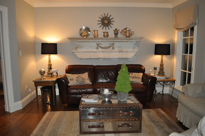 Here is the Family Room after. We added the window on the right to match the rest of the back. It was a great addition as it brings in so much light to what used to be a shadowy area. The mantel above the couch I found in the trash on the side of a road many years ago. It has an original workman's label from 1881. What a find!! I just love the feeling it brings to the space. Lamps are from Aidan Gray and the mirror is from Wisteria - It came in gold so I silver leafed it one afternoon.
 Here is the before looking from the Kitchen area out toward the Family Room area. Notice the wonderful ceiling detail that was hidden from view before we removed the upper bank of cabinets.
 And here is another photo of the after. Notice the addition of the crown moulding. The chairs are my old yellow club chairs, slipcovered in the same close-out linen from Country Curtains- a steal at $6 yard. I think they are bit oversized, but until I find what I am looking for they were an inexpensive fix.
 Here is the TV cabinet - notice the size of the TV that fit in it.
  We added a gas fireplace, mantel and surrounded the area with crown moulding. We also placed a much larger TV above. Winter is long here so the fireplace makes the space so much more cozy.
From this...
 To this...
(click to enlarge)
A final thought - I have received some email recently about rooms done by decorators that are considered "high-end" and not accessible to the average person. I just want to share with you that not all things that look expensive actually are expensive. Beauty does not have a price tag. Do not be afraid to mix $20 curtains and mantels you find in the trash with expensive chandeliers, or reproductions from mail order catalogs with real antiques. Trust what you love and it will all come together. It's not about the price, it's about surrounding yourself with things you enjoy.
We really enjoy our new space - I hope you do too!!
To see more of my house click here.
(all photos Willow Decor please do not copy without permission)


 The large entry is painted a beautiful buttery cream while the ceilings and upper mouldings are painted a contrasting white. The doors and built in mirrors add to the already light filled space. An antique woodworker's table is a beautiful place to display the owners collection of vintage hats. The light fixture is from IKEA.
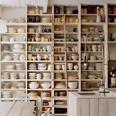 The kitchen is so wonderfully rustic. Old library shelving is painted white and used to display the huge collection of dishes and serving pieces. An antique library ladder is used to retrieve those items too high to reach. Notice the thickness of the shelves; thicker shelves were created to handle the weight of the different types of crockery. I love the interesting contrast of the industrial style faucet.
 The owners extensive glass collection is housed in an antique museum case that was painted a soft white to match the walls and highlight the glass. A collection of old unmatched chairs were also painted in soft pastels which unify them. The soft colors and leaning antique mirror add to airiness of the room. Interestingly the light fixture, which matches the entry fixture is also from IKEA.


